Posts

FINAL PORTFOLIO

Image
 HERE IS MY FINAL. I THOROUGHLY ENJOYED THIS COMPILATION OF ALL MY PROJECTS FROM THIS SEMESTER. This gave me the creativity to express myself in a way to showcase my work. I chose a light yellow background for the booklet keeping the consistent throughout, because this is my favorite color. I chose the pink and blue as accent colors because I feel as though they accent each other well. I added the colored swirls to each page to have a decorative piece and did the colored stroke outlining the text opposite color the swirls. I also tried alternating the sides the pictures where on each page to switch it up and not have each page looking exactly the same. I am happy with how this turned out and glad to have taken this class. This has brought out my creative side and I am grateful for that. 

Business Cards

Image
 For this assignment we have been instructed to create three different business card designs each will end up utilizing the three different color logos I have created in the past. These are the sketches I have created for each business card. These cards were inspired by my logo I created a couple weeks ago. My logo was created out of mountains, trees, clouds, and a sun. This logo was basically an outdoor mountain setting. Since we had to incorporate our logos into our business cards, I made my business a backpacking the mountains business. Basically the business would be for people to sign up for a backpacking trip and then we would do the work for them, so they don't have to figure out any of the details of the trip. I wanted to make the business cards something attractive to the eye, my favorite of the rough drafts would have to be the last one, where the mountains are across the bottom of the card.  I have now created the final business cards! I think when I created these I...

somewhere...

Image
 Somewhere, which is essentially anywhere, and anywhere in this case is apart of Gilmore Girls. The assignment was to take ourselves and put ourselves someplace we have never been, a suggestion was a movie scene or clip. For me I chose one of my favorite television shows Gilmore Girls. I took one of the covers for the show and simply added myself along. I believe I did a good job at blending myself into the image and making it look as though I was an original character in this show. The only part I think I could've improved upon is the difference in skin color seen. The original characters have a paler tone in this image, something that I tried to match for myself but couldn't quite get it to match. I think it was fun to insert myself into a promo for a show I like, it's as close as I'll ever get to actually being in the show myself. For this project I added my tag brush at the end of the title, to resemble a copyright symbol.  Here are the original images:

pre-somewhere inspo

Image
 For the upcoming Somewhere assignment we were instructed to view a couple things for inspiration.  After viewing https://www.instagram.com/kirbyjenner/?hl=en I was asked to chose one image that would be hard to photoshop myself into. This is the image I chose: I believe that this photo would be hard to photoshop myself into because it is so intricate. If you look at the placement of Kirby in this picture he is in between two others, holding items and being leaned on my Kendall Jenner. With so much going on around him and being so involved in the photograph that would be a challenge to put myself into.  After viewing https://www.instagram.com/averagerob/ I was asked to find an image that inspired me or gave me an idea for the somewhere project. This is the image I chose: By Rob inputting himself into an image from the Simpsons gave me the idea to put myself into a TV show that I like. Taking a still image and inputting yourself into the scene of a show is a cool...

Autoscopy

Image
 This project was super cool, I really liked it! Below is my final construction. Below is my original image. Here is my images used for final composition. For this project I was instructed to create an image in an environment where I have never been. For me someplace I love, someplace I admire, and someplace I would love to go is space, specifically the moon. So for this PhotoShop project I have inputed myself into the galaxy. Since this for me to achieve is near impossible, I put myself on a trampoline, to say that I jumped into space. I thought this would be a cool way to portray me being someplace I have never been before. I added to this image the moon, located in space, and it being the place I would love to go the most I found it fitting. I also added the milky way in behind be at a lower opacity because that is where we all live, that is our universe and our galaxy. Lastly I put a UFO, something that is believed to be seen and believed to exist. I personally believe that the...

Tag Brush

Image
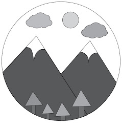
 For this assignment we had to take our black and white logo we created, turn it into a tag brush, and then create an image out of the brush. Here is my black and white logo. Here is my tag brush. Here is the image I created using my tag brush. For the image I created using my tag brush I went off of my actual logo. My image using the green color with my tag I tried to create mountains like that were in my logo. The mountains in this image have the white caps like my logo that's why they aren't pointy. Then there are the blue tags which represent the clouds. Lastly the singular yellow tag is the sun. I think that the image I have created could have been better however I think it was a good use if my tag and has meaning connecting it to my logo. I did not like this assignment however because it was not very interesting. 

B&W -> COLOR

Image
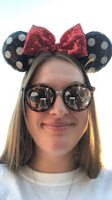
 This project was very time consuming for me. Below you will find my original photo, b&w conversion, and three color versions I have created. For this project I chose a simple selfie, but one that had some accent accessories in it that I knew would make for a better edit and bring interest to the piece. For the first colored image I chose to do monochromatic with the reds. I made this choice because with the Minnie Mouse ears, the bow being red, I thought it was a simple choice to make that actually made sense for the original image. The second colored photo I started with my favorite color pastel yellow and from there chose the best color scheme which in my opinion was split complementary. For the last image I did a double complementary scheme which had many different colors in it which I liked them all together. Choosing each different scheme was fun and made the project more interesting, I like using the adobe color swatches better than just choosing random colors on photosh...

Photoshop Tutorials

Image
 For this assignment I am going to be reviewing three Photoshop tutorials that I watched. This tutorial was all about changing the color of anything in PhotoShop. It requires a hue saturation adjustment layer which allows for the easy color change. By using the 'master' drop down it will change all the colors in the image. If you want to change a specific color in the image use the eyedropper tool to select the color on the image then by sliding on the hue bar you are then able to change to the desired color for that part of the image. I think that this tool will be very useful when I am creating my projects. I think a big part of PhotoShop is altering images to make them different from how they started and changing colors is a big aspect of that.  This tutorial focused on cropping, resizing and adding more space. The crop tool can be found on the tool bar or accessed by hitting 'c' on the keyboard. At the top of the screen you can find the ratio button with drop down o...

Propaganda Poster

Image
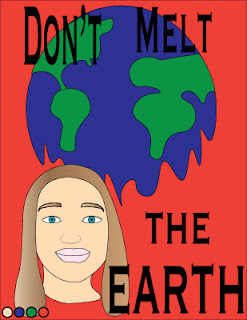
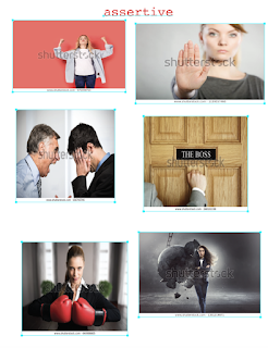
For this project I decided to create a propaganda poster for climate change. Below is my poster. For this project we had to include a self portrait aspect, here is the photo I used to base off my portrait. I began by collecting some inspiration photos, here they are. When the assignment was first assigned to us I immediately thought of climate change as something that I wanted to create my propaganda poster about. Climate change, the environment, and global warming are very important aspects to me. I believe that if we continue on with the way the world operates that there really will be nothing of livable conditions for us to survive on in the future. I have watched countless documentaries and environmental shows that show how the earth has changed, how it will change, and what can be done about this problem. It is something I am very passionate about. When creating my self portrait aspect of the project I wasn't really sure how to include it on my poster but to me it signifies ho...

Adventure Logo

Image
 To start off this project I chose five words that described myself and created moldboards for each word.        After creating the five moldboards I went on to create 5x5 rough draft logo sketches for each. After creating all the sketches I chose one logo and took to illustrator to create b&w and color versions. The color versions are my final completed versions of my logo.  When starting this project and choosing words to describe myself I feel as though with some of the words I could've chosen better words for the final part being needing to create a logo for it. The words I chose besides adventurous were very hard for me to figure out what to draw for the logo and I honestly did not like any of those drawings. From the start I knew I would end up chasing adventurous because I had this logo idea from the start. I enjoyed this assignment because it was very creative and I had freedom to create whatever I chose to. I really like working in Illustrator ...