Tag Brush
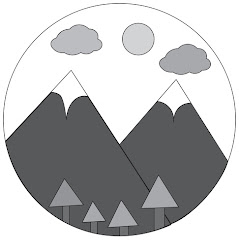
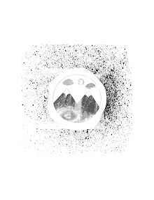
For this assignment we had to take our black and white logo we created, turn it into a tag brush, and then create an image out of the brush.
Here is my black and white logo.
Here is my tag brush.
Here is the image I created using my tag brush.
For the image I created using my tag brush I went off of my actual logo. My image using the green color with my tag I tried to create mountains like that were in my logo. The mountains in this image have the white caps like my logo that's why they aren't pointy. Then there are the blue tags which represent the clouds. Lastly the singular yellow tag is the sun. I think that the image I have created could have been better however I think it was a good use if my tag and has meaning connecting it to my logo. I did not like this assignment however because it was not very interesting.


Hi Katie! I think it's so interesting we both did mountains with the sky, but we executed it so differently haha. Yours is so cute and fun, and I think the tag brush turned out really well, and everything is really easy to distinguish and read. The colors you used were perfect for a cheery vibe. Good job!
ReplyDeleteHi Katie -- the tag brush design is really cool and I like how the spray paint is splattered. The green design is cool especially with a lower opacity. Overall, good project !!
ReplyDelete