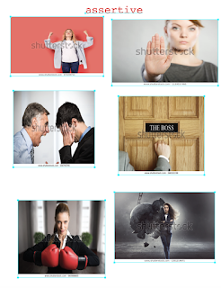
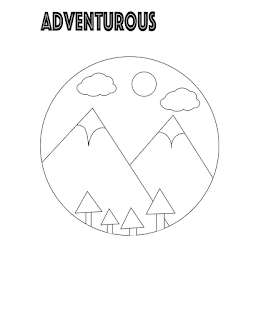
To start off this project I chose five words that described myself and created moldboards for each word.
After creating the five moldboards I went on to create 5x5 rough draft logo sketches for each.
After creating all the sketches I chose one logo and took to illustrator to create b&w and color versions.
The color versions are my final completed versions of my logo.
When starting this project and choosing words to describe myself I feel as though with some of the words I could've chosen better words for the final part being needing to create a logo for it. The words I chose besides adventurous were very hard for me to figure out what to draw for the logo and I honestly did not like any of those drawings. From the start I knew I would end up chasing adventurous because I had this logo idea from the start. I enjoyed this assignment because it was very creative and I had freedom to create whatever I chose to. I really like working in Illustrator because the application makes sense to me and I am able to navigate it easily and create what I want to make. I feel as though I executed exactly what I envisioned for my logo and I am very happy with the final outcome. I did however struggle to come up with color combinations for the last color logo so I ended up doing shades of pink and purple and I am not the biggest fan of it but I really like the other two so I am okay with that. My favorite logo I created is the top one with the lighter pastel colors that are more realistic. This has been my favorite project so far!


Comments
Post a Comment